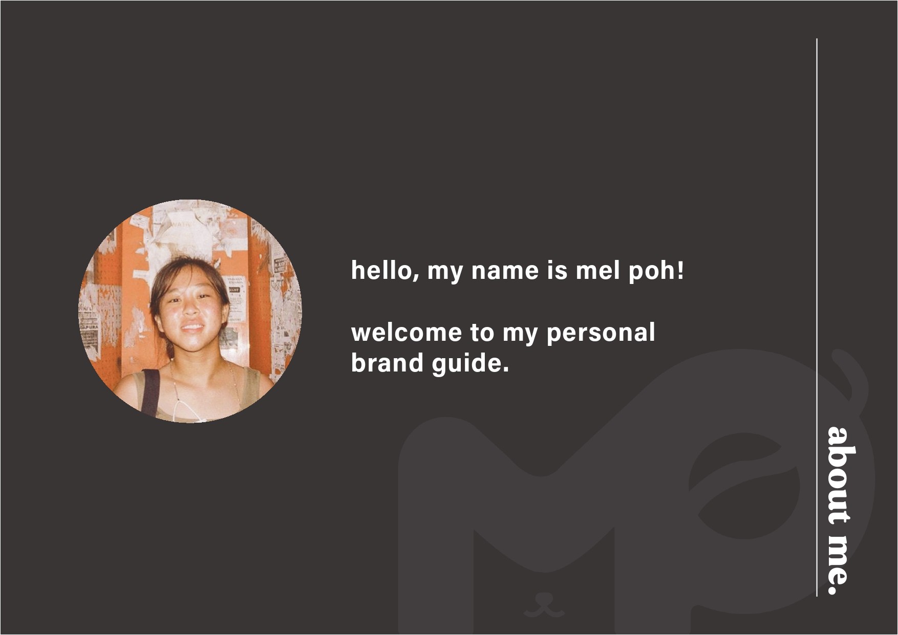
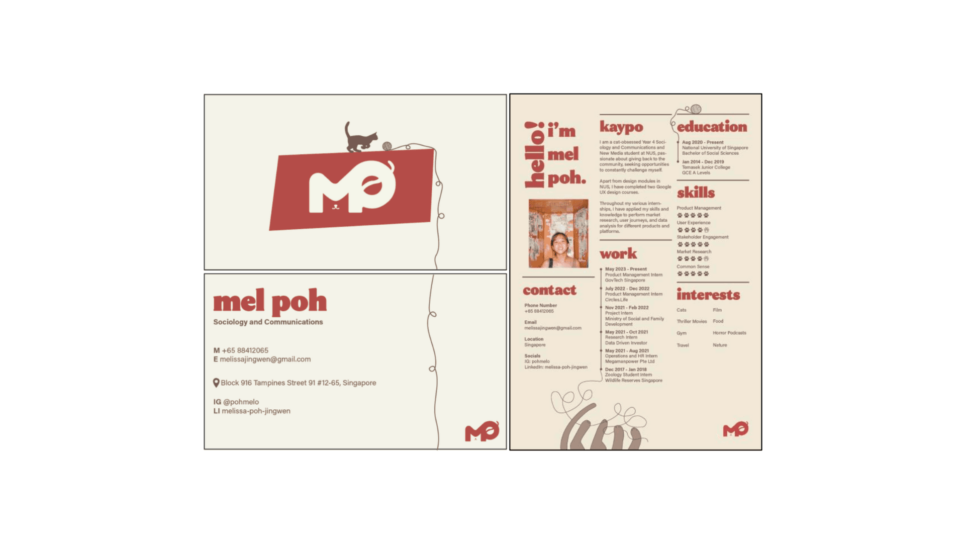
Brand Style Guide
As part of a design module NM3217: Principles of Visual Communication Design, we were tasked for our final project to work on a brand identity by creating a publication in the form of a brand style guide. The final deliverable was a brand style guide including a logo, business card and resume.
Year
2023
Software
Adobe Photoshop
Adobe Illustrator
Adobe InDesign
Thought process of first draft
To kickstart the branding project, I followed the stages outlined in the lecture to ascertain the basics of my brand’s look and feel. This was vital in gaining intimate knowledge of my brand which I can then translate into a visual language.
Research
I knew that I wanted my brand identity to revolve around cats, hence I was ooking through my good ol’ Pinterest boards for inspiration on the overall aesthetics ofmy branding assets. I did eventually find some which would inform my final design of the logo and resume.
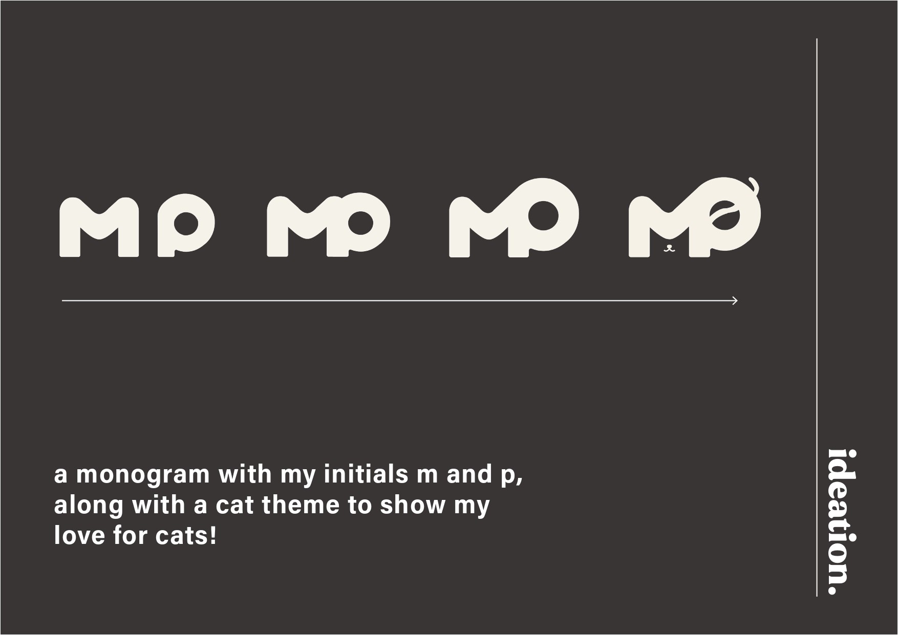
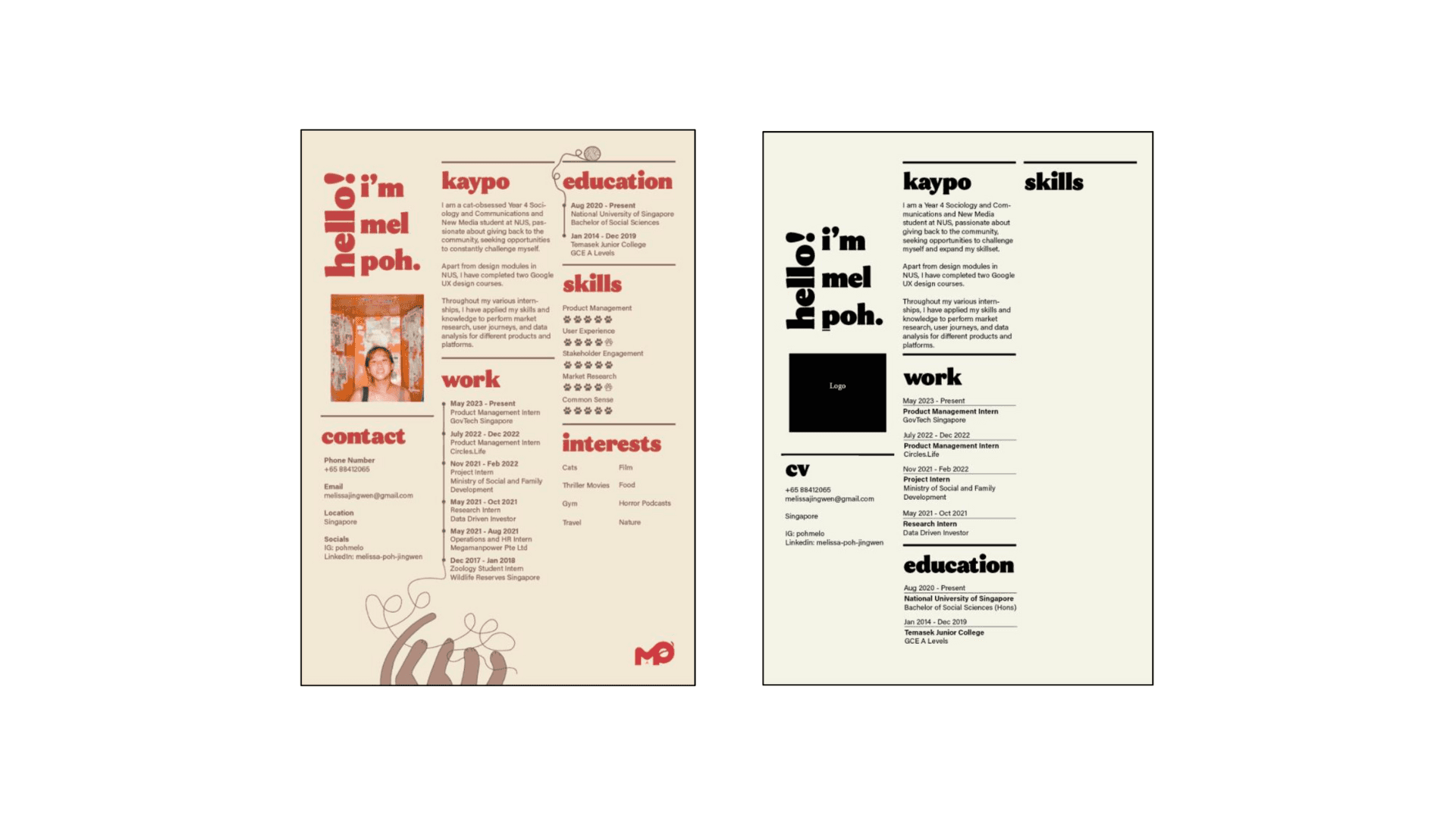
From my preliminary research, I knew that I wanted my logo to be a monogram of my initials M and P (my full name is Melissa Poh, but I’ve shortened it to Mel Poh since it’s easier to remember). I also wanted my resume to retain a professional feel yet whileincorporating some “pop” through colour and other visual elements.
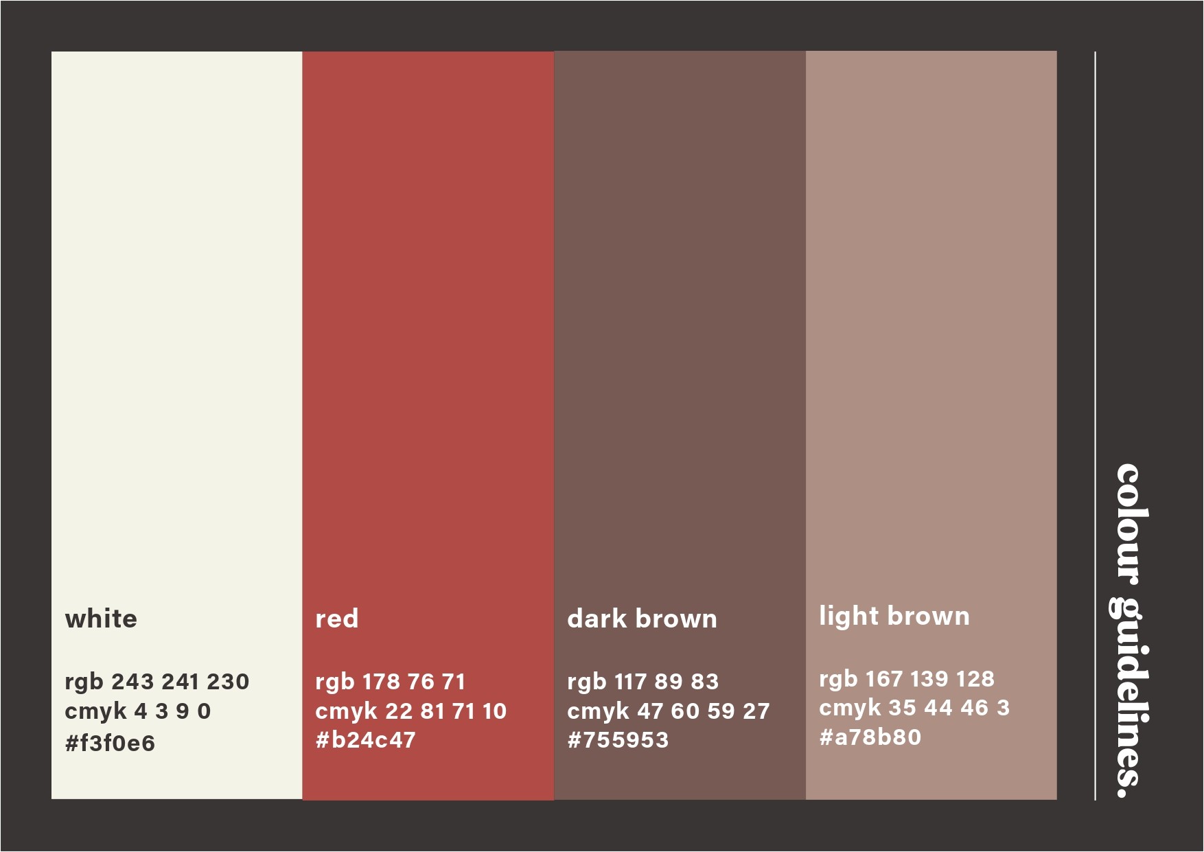
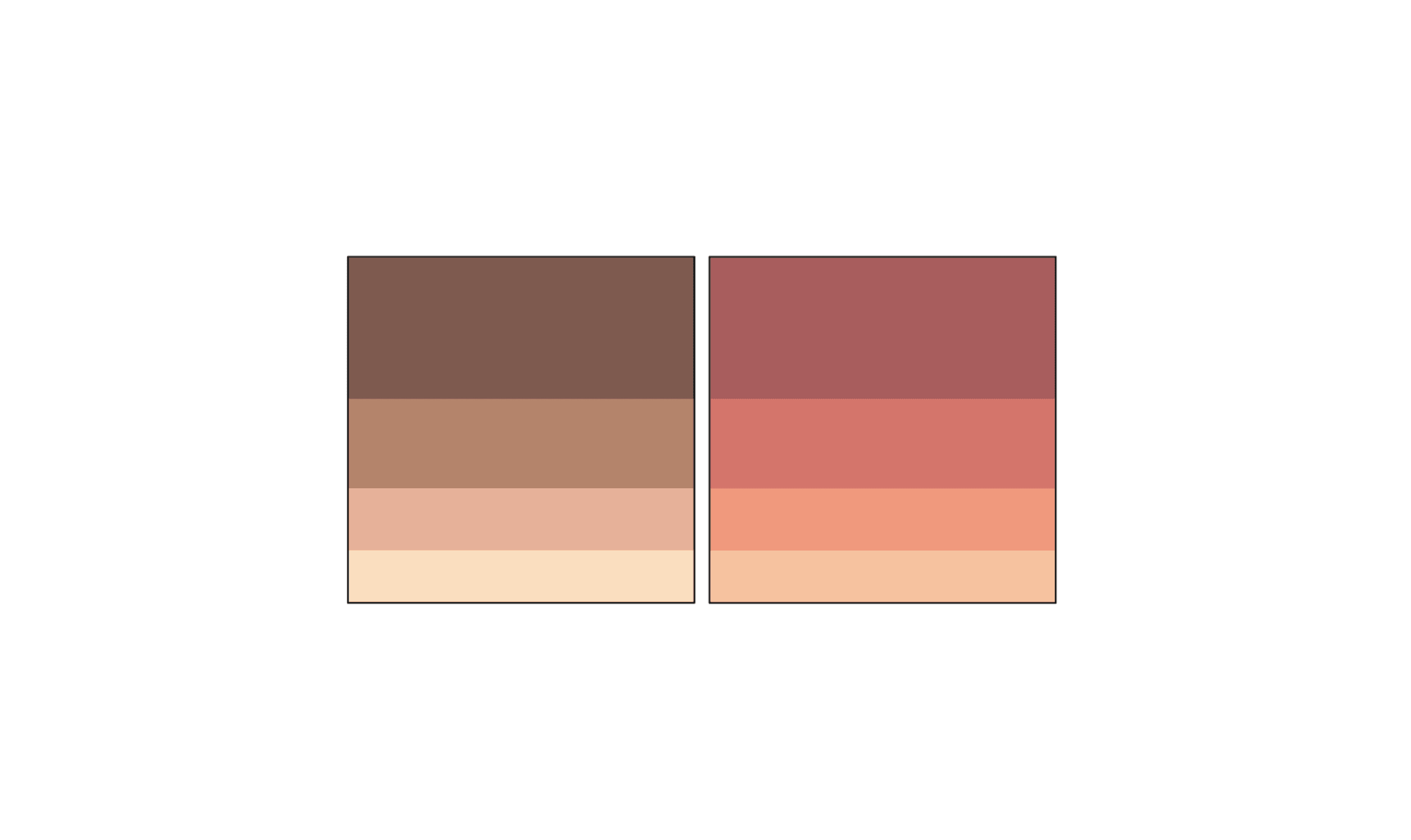
Colour Palettes
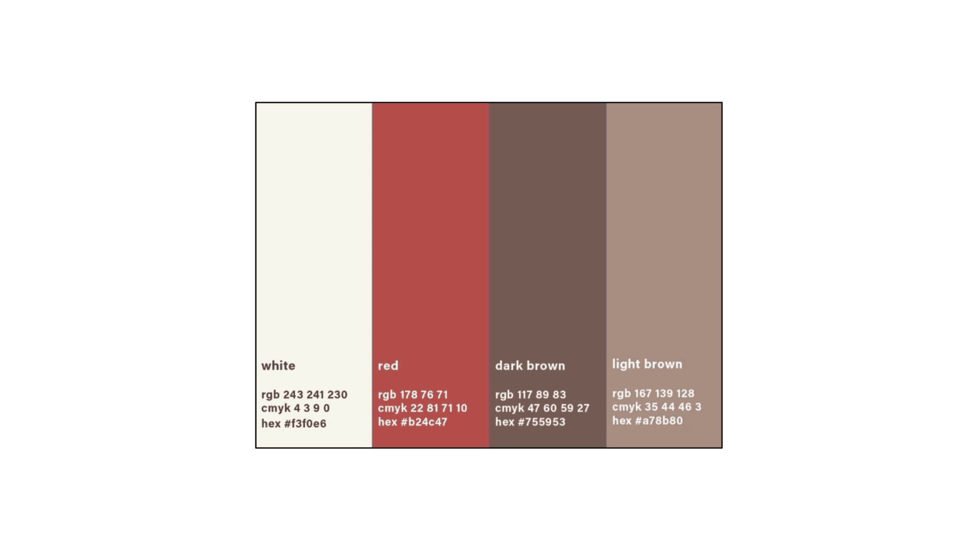
While browsing colorhunt.co, I came across a few colour palettes that I really liked. I was really digging the warm autumn colours as it was inviting and rich, but I was also wary of the browns and red being too overwhelming. Hence, I decided to incorporate some form of white as my main colour, along with the browns and red. I felt that this made the final colour scheme clean and flexible, supplying enough options to be creative but not enough to overwhelm.
Imagery
Logo
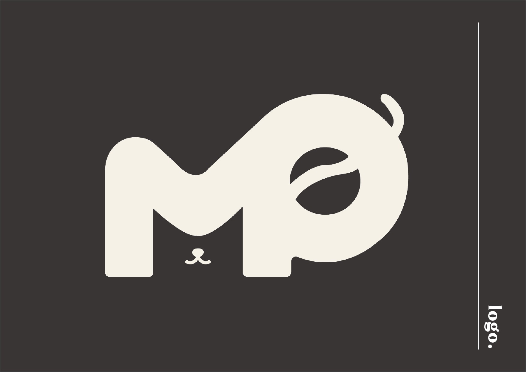
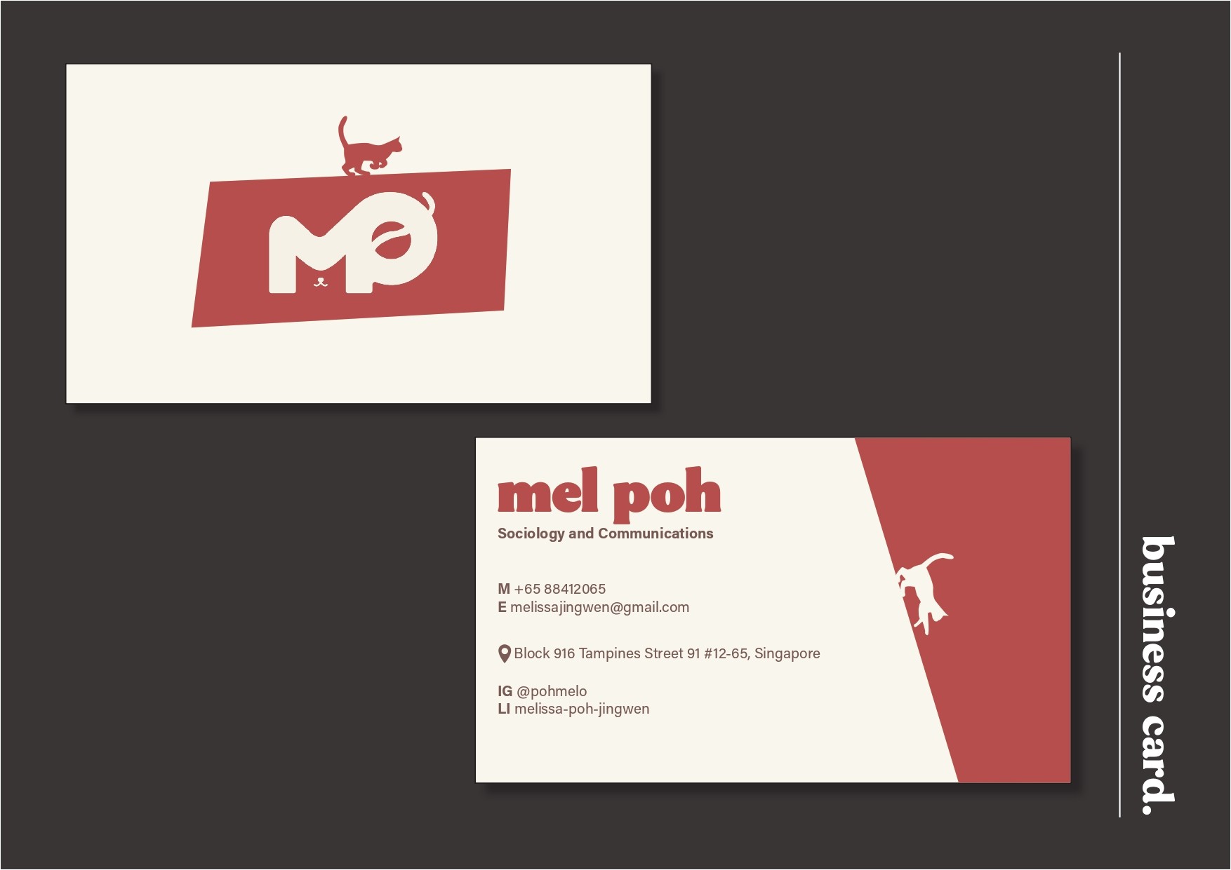
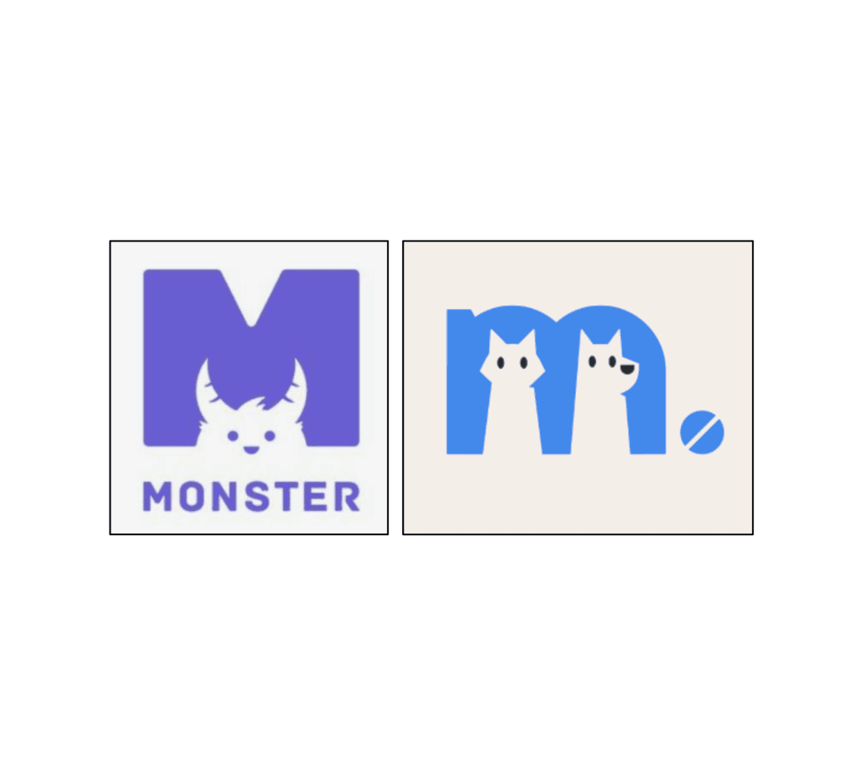
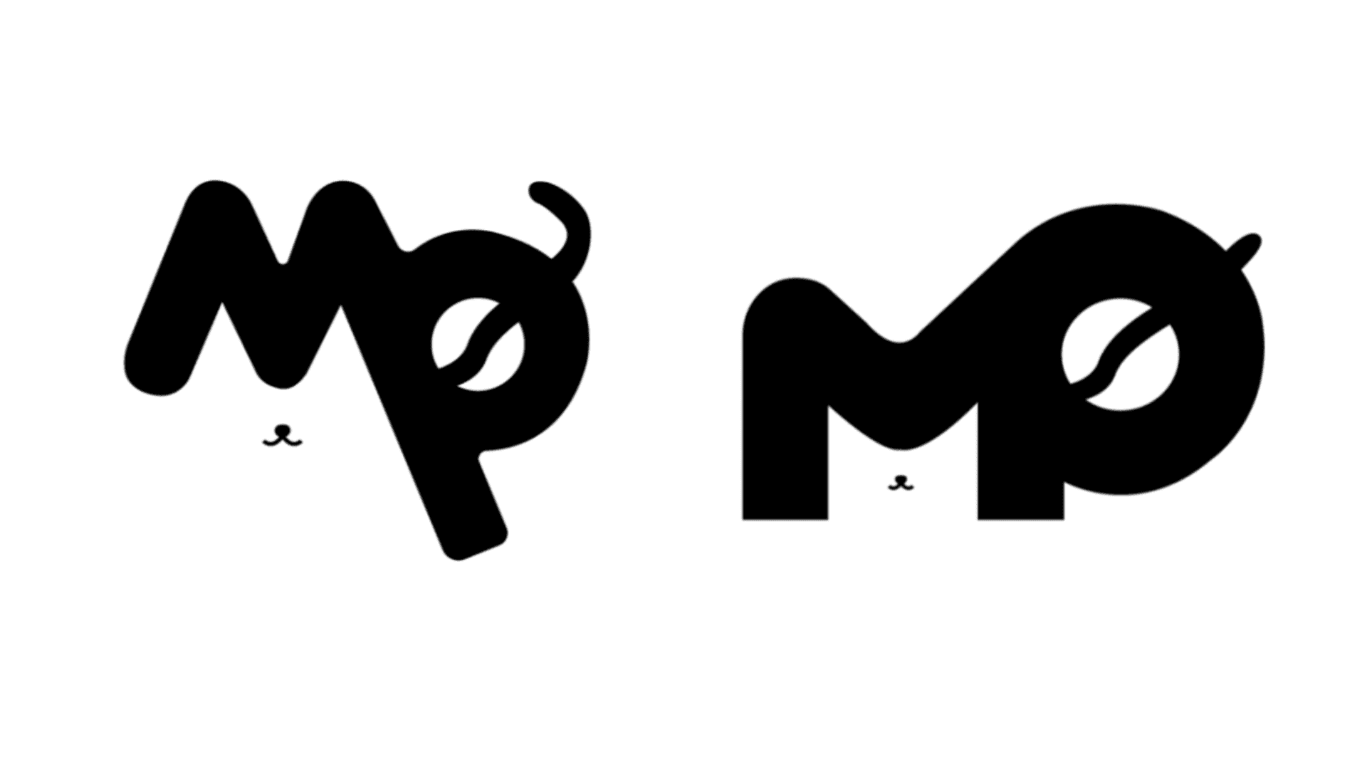
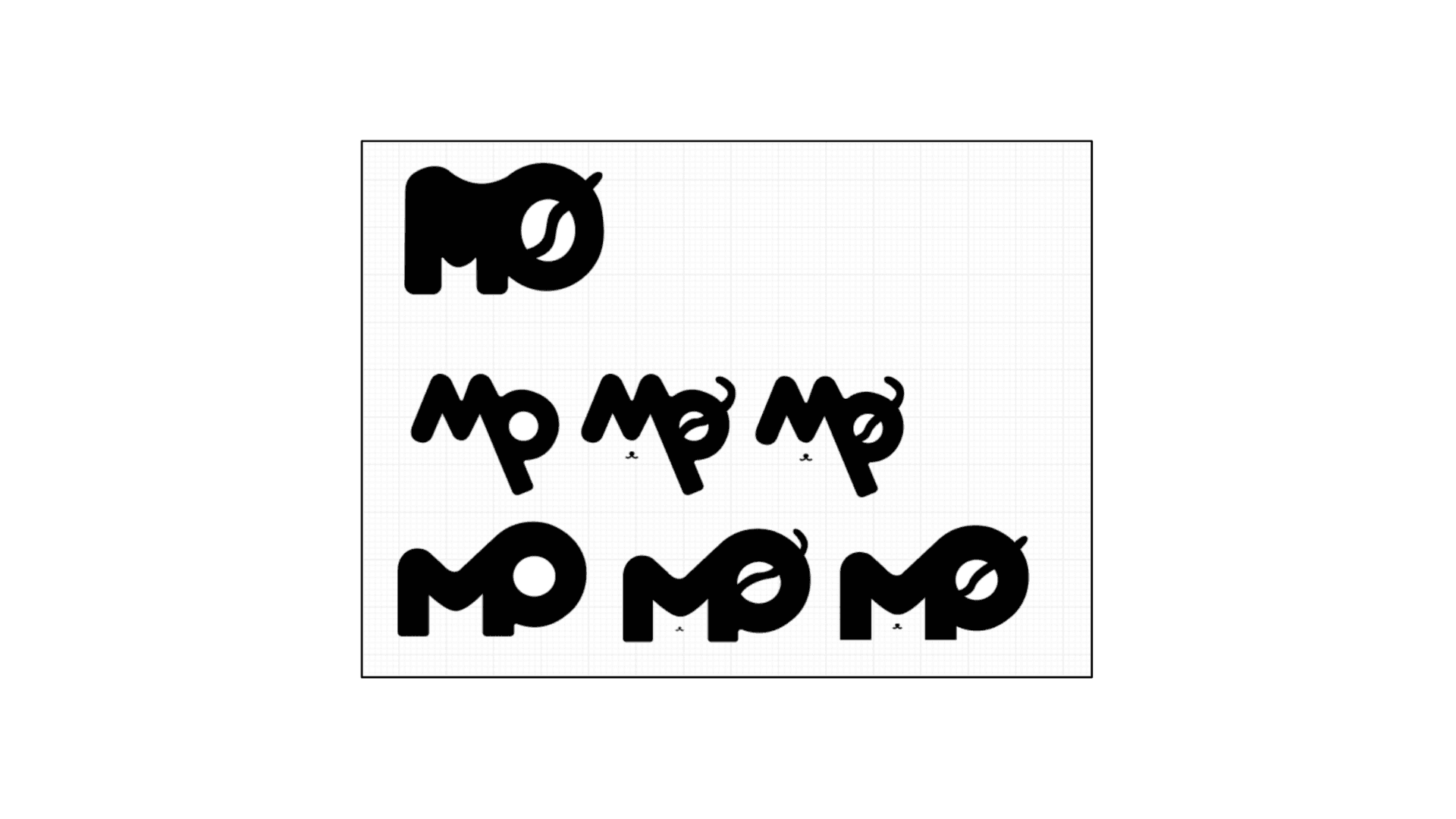
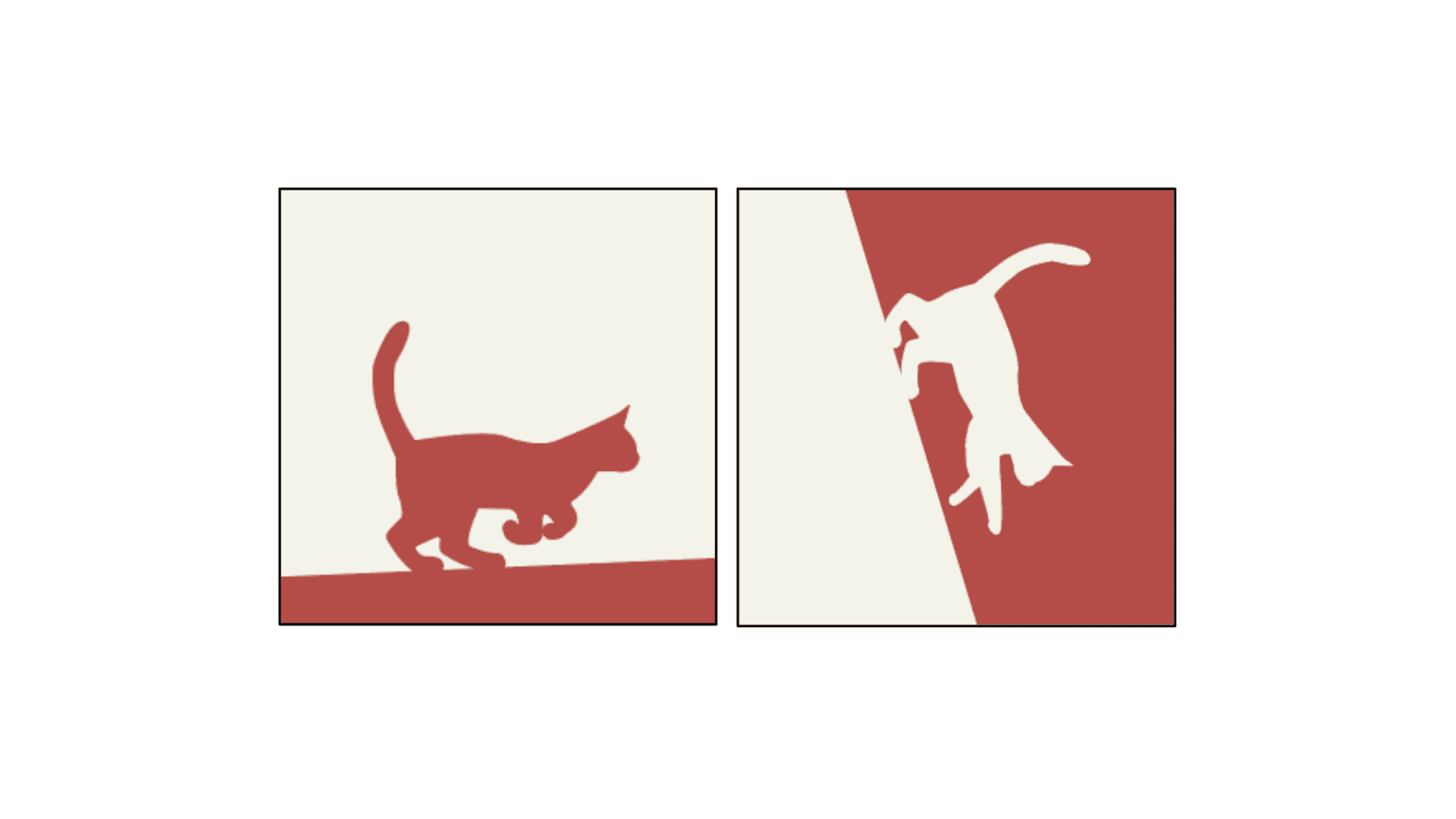
Since a brand identity is an intricate design system, each element influences the other. The logo is the first imagery I created for my brand, and it was integral that the logo was powerful enough on its own to deliver the brand persona. Thus, I was set on designing a logo that combined two letterforms: M and P (my initials) to infuse the logo with significant personality and meaning. Of course, there also had to be a feline element to it which was the core defining feature of my brand. As seen from the two iterations below, I was playing around with the positioning of the letterform P but I was determined to go ahead with the use of negative space in the letterform M to portray a cat as well as its tail through the letterform P.
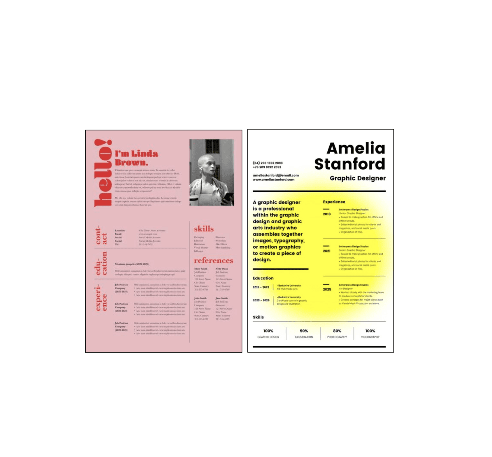
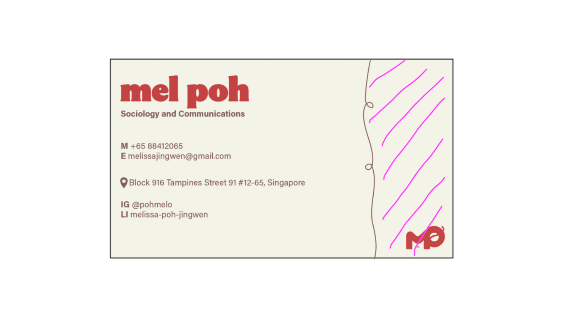
Business Card and Resume
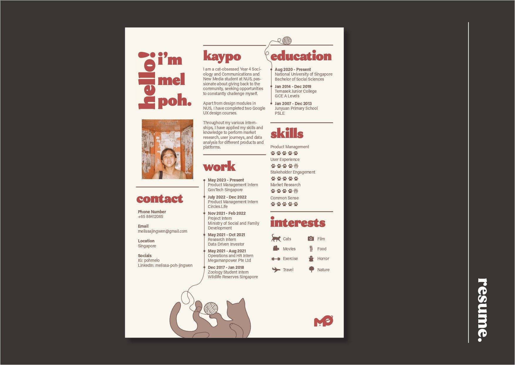
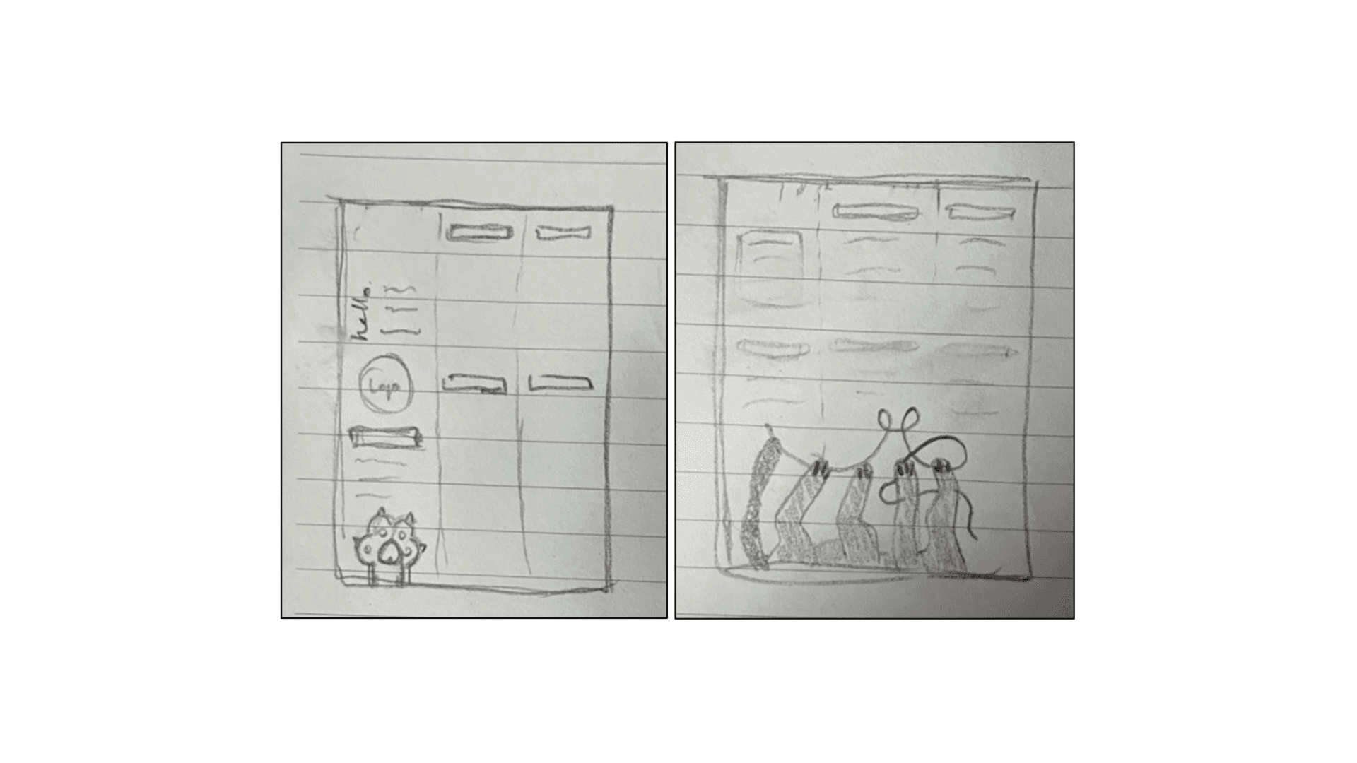
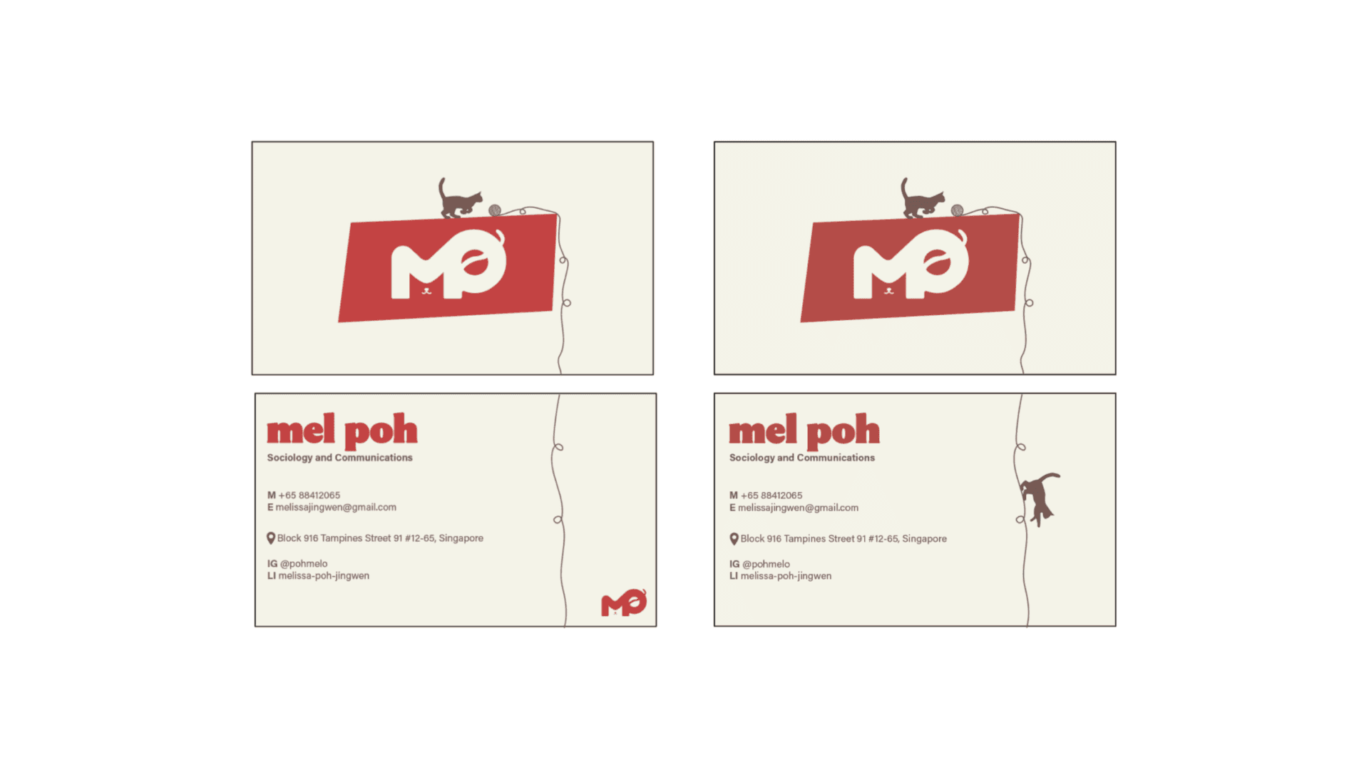
For the first draft of the other assets – business card and resume, I was going for a simplistic design with small quirks that would catch the attention of viewers whilst retaining a professional aesthetic. At this point in time, I was still playing around with the primary colour as seen from the different colored backgrounds of the business card and resume. I did end up going with the cooler-toned white in the business card as I felt that the warm beige shade did not contrast well with the red and brown accent colours in the resume.
While I was pleased with the coherent feline theme throughout the assets, I was not too sure about the back of the business card. Inititally, I thought it would be cool to have the ball of yarn that the cat is chasing on the front of the business card continue into the back. Even though it provided a sense of continuity and flow, the delineated space by the ball of yarn felt out of place and I didn’t want to force it by adding unncessary things.
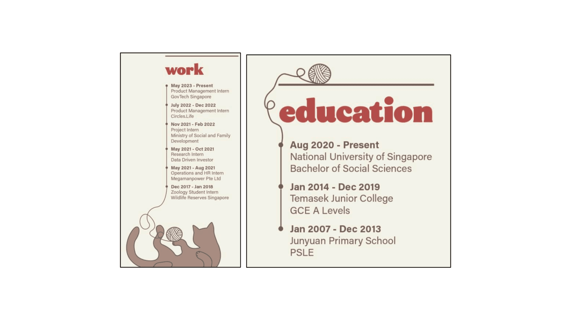
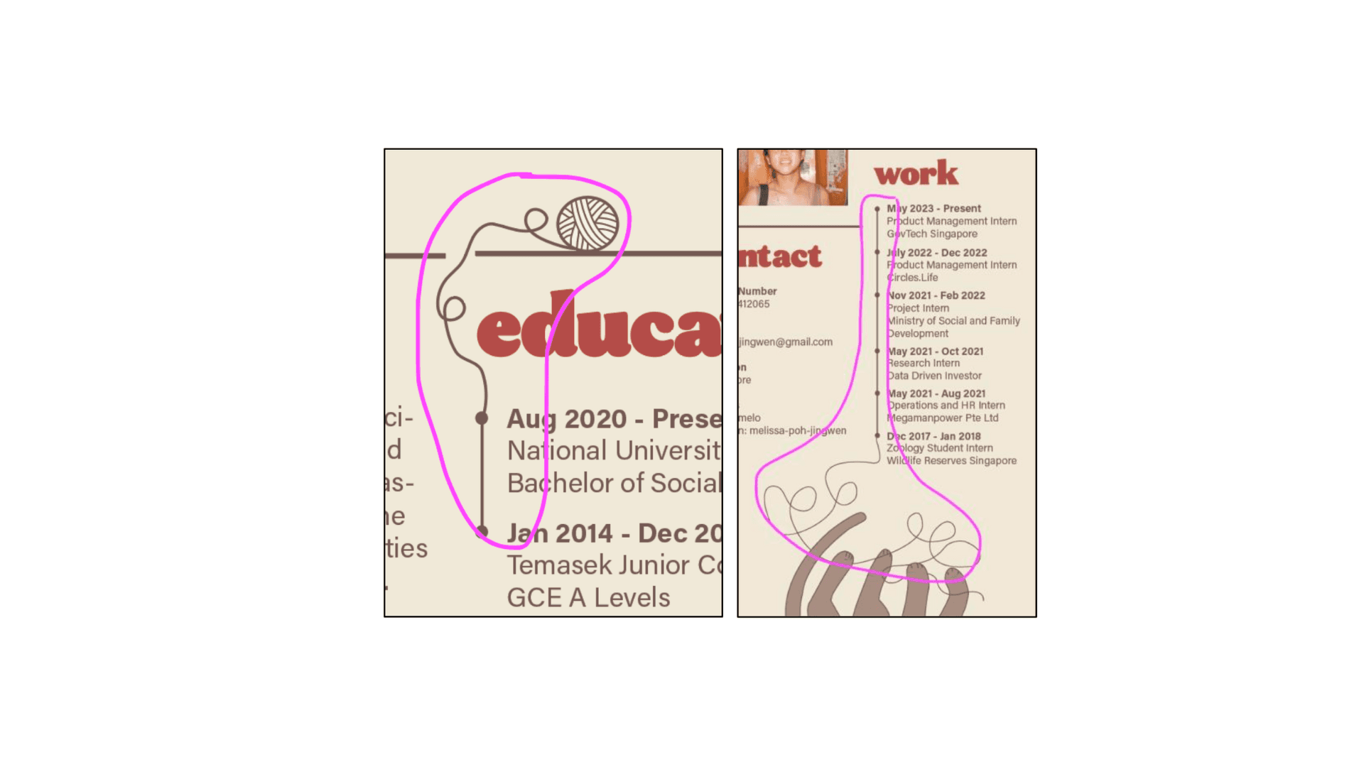
Other visual elements that helped “tie” the feline theme together (haha get it cos yarn is used to tie things…) were the yarns or strings that connected with the linear chronological lists for my work and education experiences. I added this with the intention of creating some visual interest as there were some empty spaces in the resume and it felt like a pretty clever way of incorporating some feline elements. I would later go on to change the illustration of the cat playing with the string as it didn’t seem to resemble the legs of a cat.
Ideation & Design
Ideation of logo
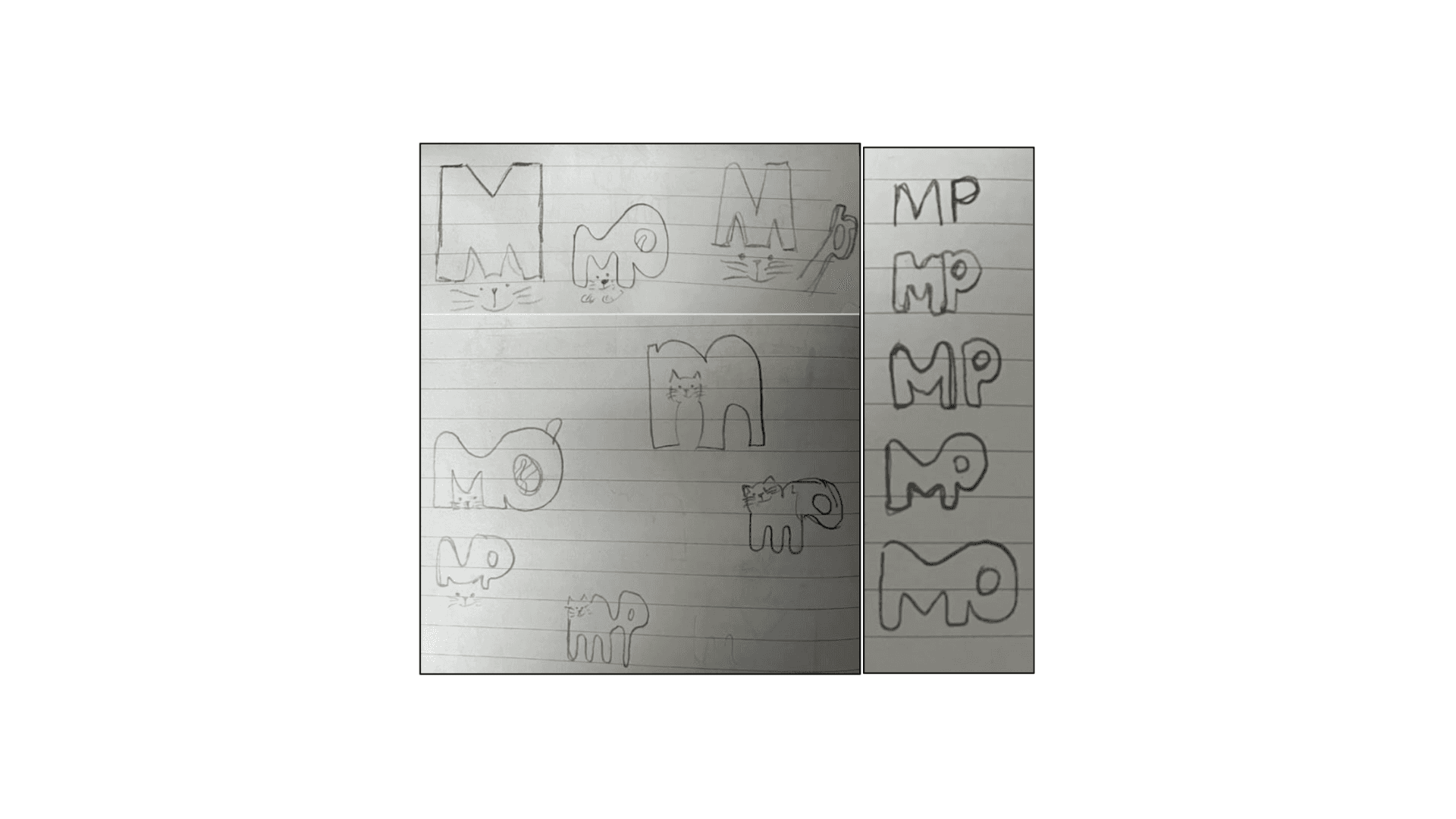
Iterations of logo
Ideation of resume
Iterations of resume
Iterations of name card
Application of methods in visual communication design
Space
I played around with positive and negative space to portray cats in my visual assets. For example in my logo, I depicted a cat using the negative space of the letterform Malong with a cat’s core characteristics – nose, pointy ears and tail.

In my business card, I inverted the colours of the cats on the front and back to enhance visual contrast. This also allowed me to utilise positive and negative space respectively to delineate the silhouettes of the cats.
Colour
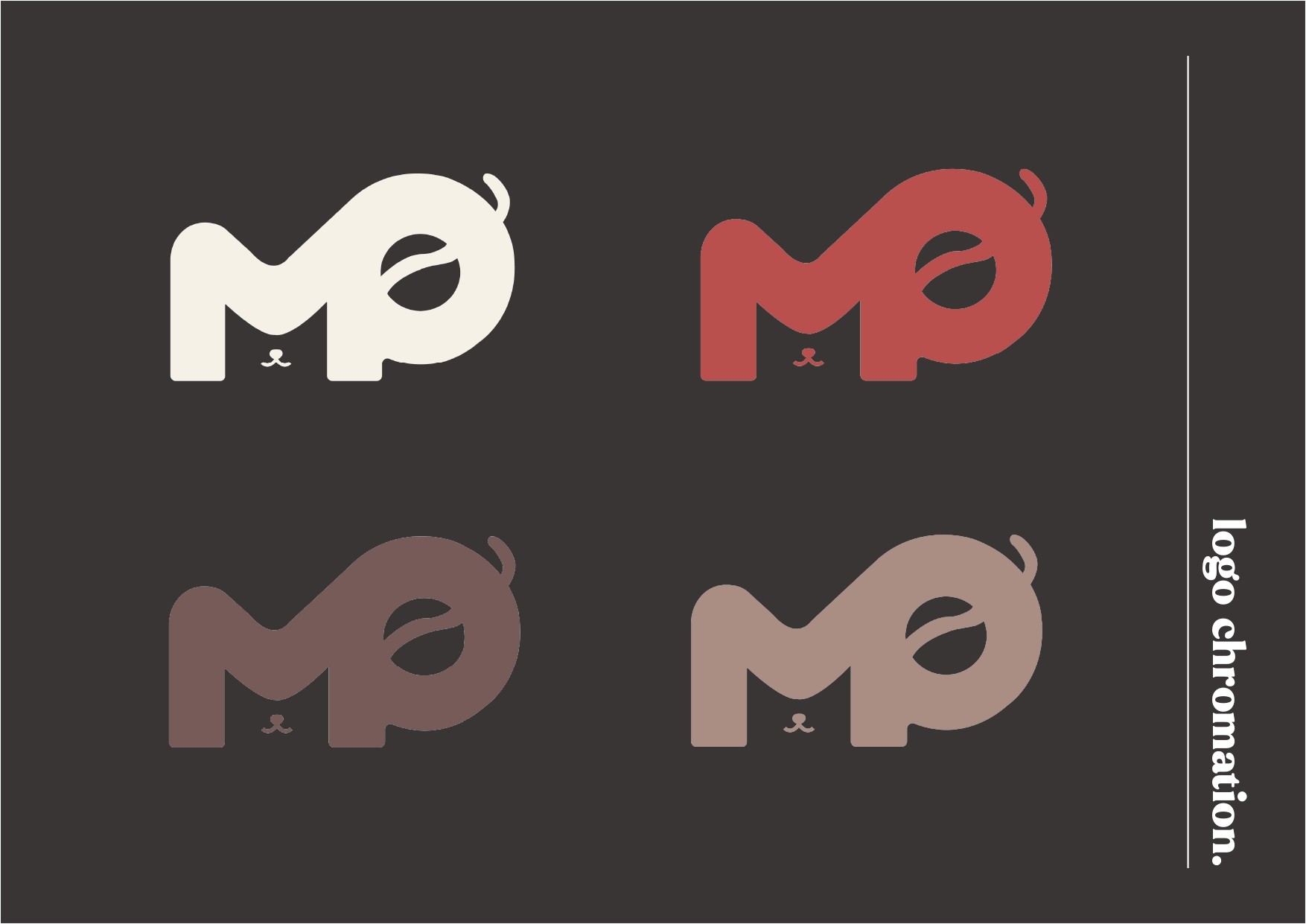
For the background of my visual assets, I chose a neutral colour: white to maximize readability of the texts and for illustrations to stand out. One of the secondary colours is red. Besides contrasting well from the neutral beige background, it also conveys an emotion of urgency, drawing attention to the graphic elements and header texts.
Taking into account the aforementioned colours (white and red), the other shades of brown were chosen as secondary colours to further build on the sense of warmth and comfort. Similar to the red, the brown contrasts well from the neutral background, allowing visual elements to pop. Overall, all the colours complement well with one another, creating a sophisticated and visually pleasing display.
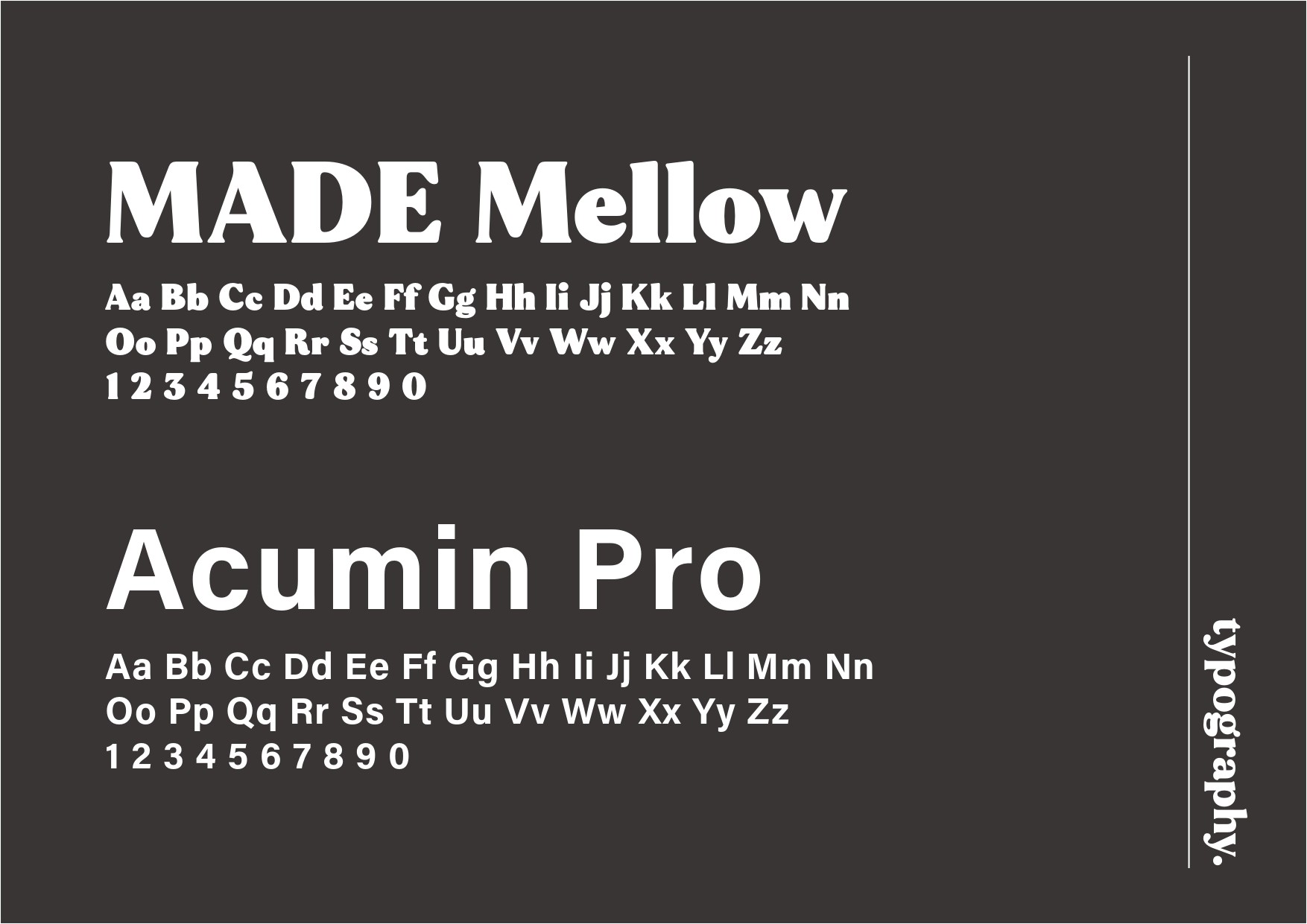
Typography
Most, if not all, heading and body paragraphs are left-aligned. This makes it easier for viewers to read each line as there is a straight left edge which can be used as a point of reference, guiding them to read in a natural flow.
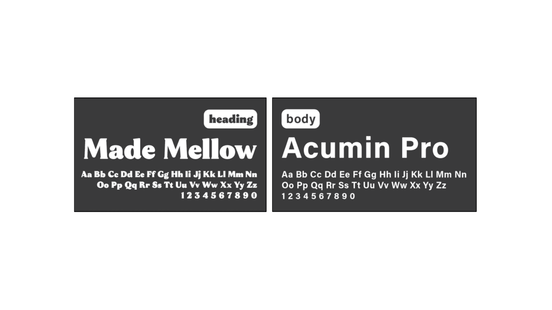
For the typefaces, I used a pairing of a serif typeface for headings paragraphs and a sans-serif typeface for body paragraphs to ensure sufficient visual contrast between texts in the infographic to hold the audience’s attention.
As show below, the typefaces: Made Mellow and Acumin Pro are contrasting but complementary, making it easier for the audience to differentiate between different parts of the text, while keeping it visually interesting.
Lines
For a more organized layout and arrangement, I used horizontal lines above each header to delineate the spaces between each chunk of information.
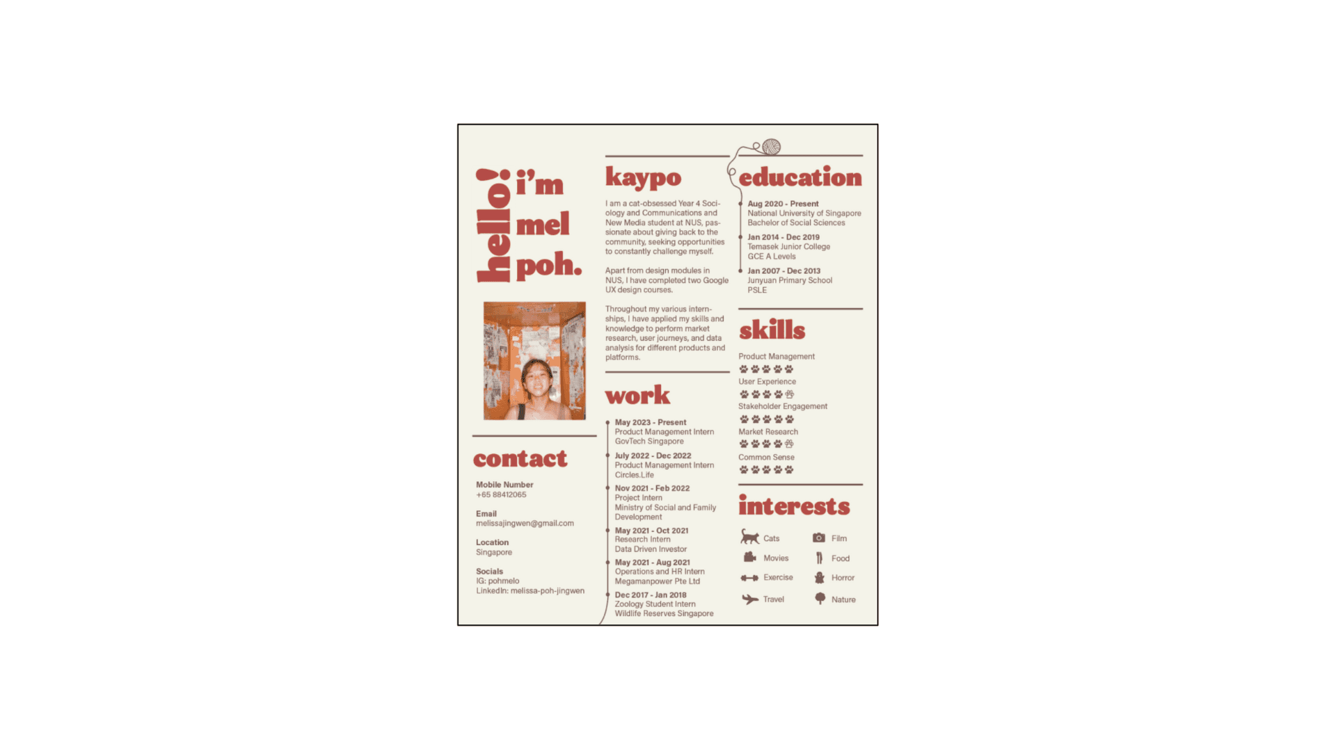
As for implied lines which is the path that viewer’s eyes takes as it follows shapes, colours, and form along a path, I connected the balls of yarns with the linear chronological paths that outline my work and educational experiences. My intention behind this was to further emphasise the implied flows of the body paragraphs.