IT Support
During my UI/UX internship with GovTech, I was tasked with adding an article rating feature into the IT Support mini-app.
UI/UX Designer
2024
Figma
Research
Prototyping
Screen Design
Background
When faced with IT issues, public officers typically reach out to the help desks of the mini-apps they are using by sending emails, making phone calls, or filling out forms. The IT Support mini-app creates a more convenient and efficient way for public offers to report IT-related issues.
The addition of the article rating system allows us to assess the helpfulness of the articles in solving user queries. Moreover, user feedback can aid in content improvement and overall ticket reduction.
Research
Here, the design challenge was: How might we encourage users to rate the articles? I took some time to research common designs and logic flows of user ratings and review systems across popular websites and applications. I have summarised the main findings from my research.
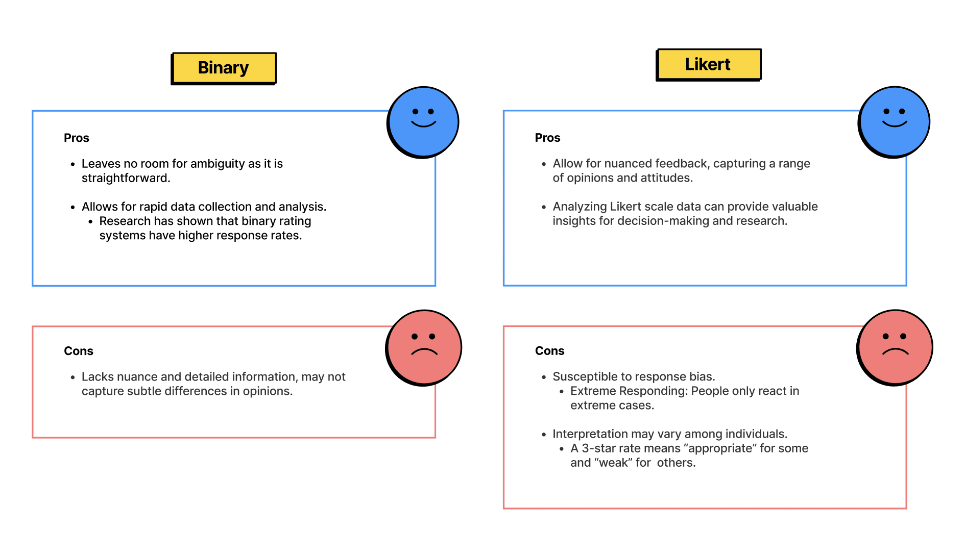
After weighing the pros and cons, I chose to go with binary ratings. Additionally, its cons can be easily circumvented by providing an open-ended section for users to input more detailed feedback.
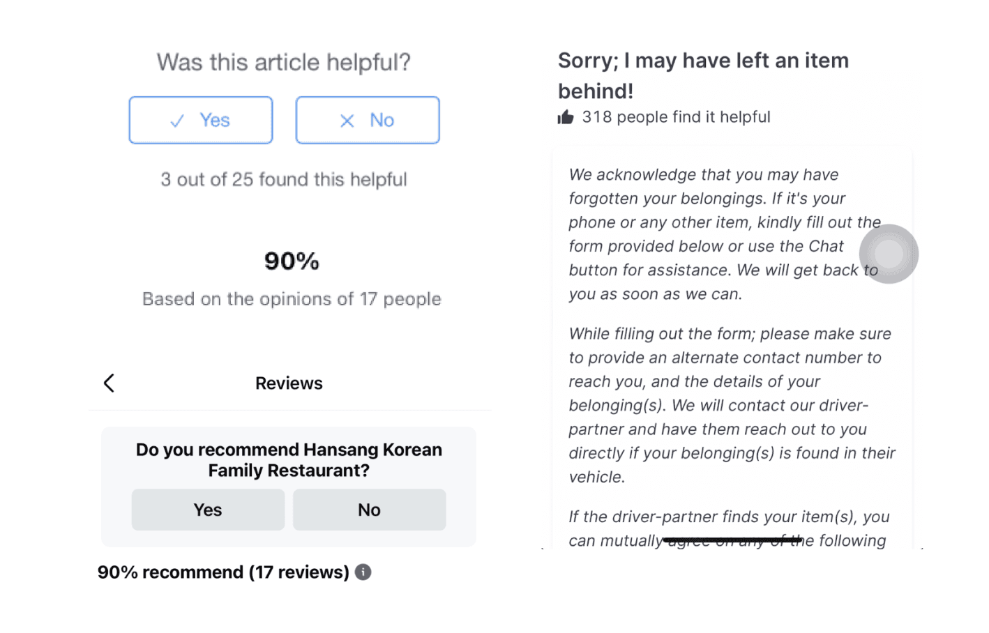
Desktop research revealed that a majority of applications / websites displayed the number of ratings. However, after weighing out the pros and cons, I decided against it.
My rationale was that these numbers were more helpful for the back-end team as compared to users. If an article is negatively rated by majority of its previous viewers, users are more likely to be turned away from reading the article. Following this, they are likely to report the issue to a help-desk, undermining the objective of the ratings feature — to reduce ticket numbers.
On the other hand, this data should be made available to the back-end team as articles with overwhelmingly negative ratings should be updated ASAP.
I decided that this was unnecessary as it is not useful for users to know that they had previously viewed and rated the article. Furthermore, if users are re-visiting the article, it signals a deeper issue as the user's issue has not been resolved and the article’s content may be inaccurate.
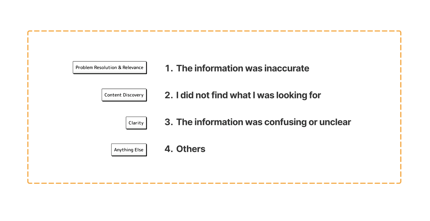
After compiling a list of common phrasings, I shortlisted these four options as they collectively address various aspects of the subject matter, ensuring that the feedback gathered would be comprehensive, useful and actionable.
Design Considerations
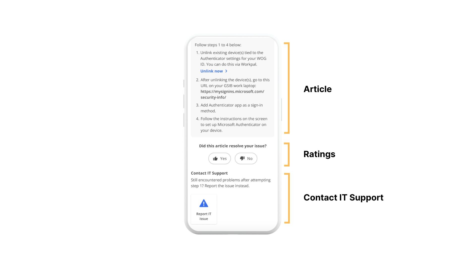
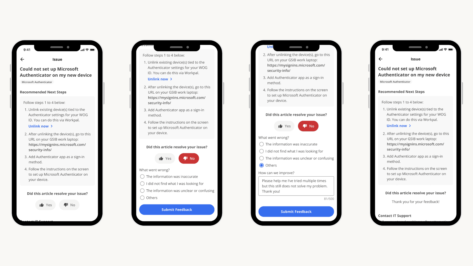
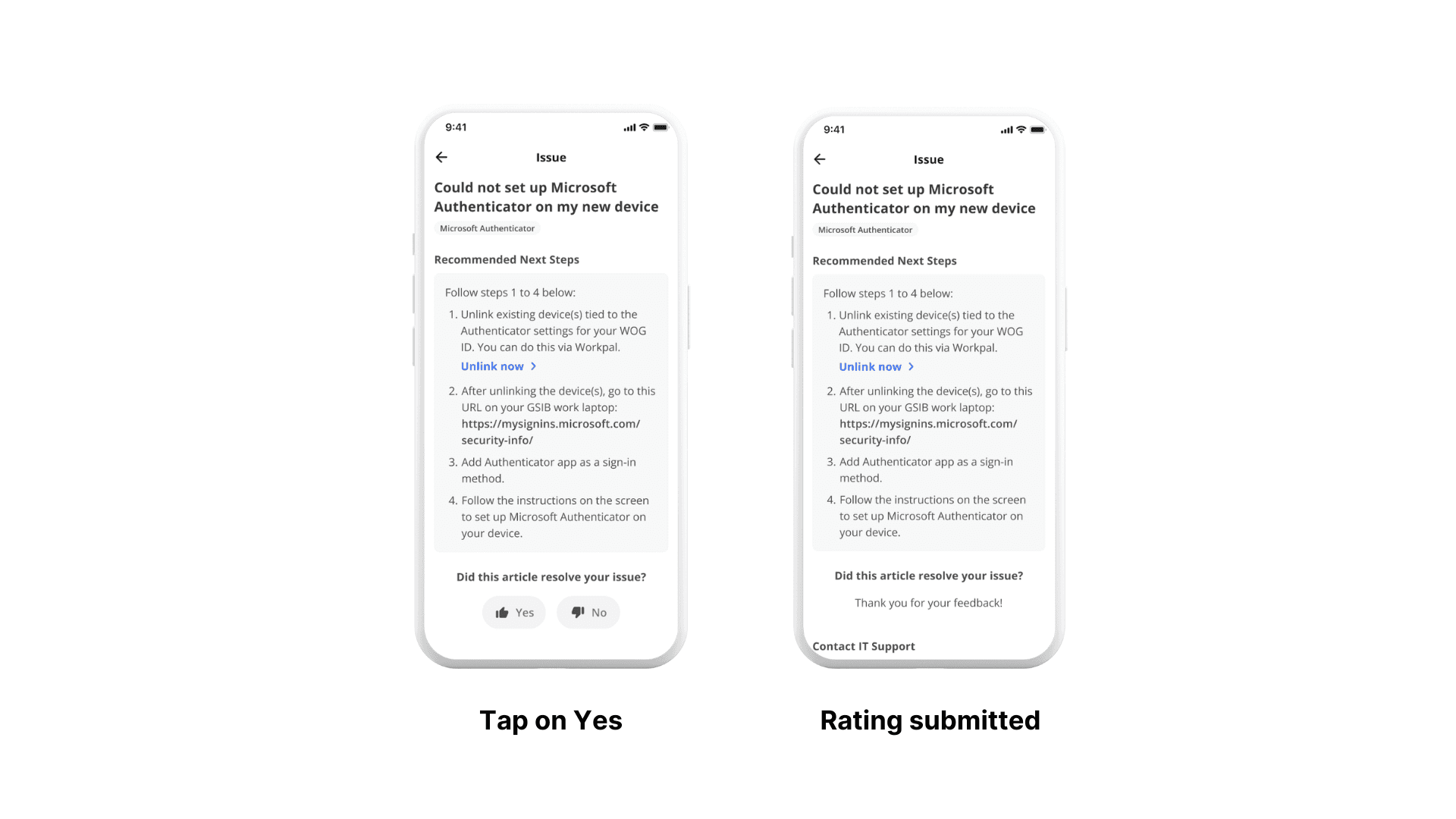
We opted to position the ratings feature at the bottom of the article so that it catches the users' attention right after they finish reading, thus increasing the probability of them leaving a rating. While it does push the 'Contact IT Support' section down, it remains discoverable by users.
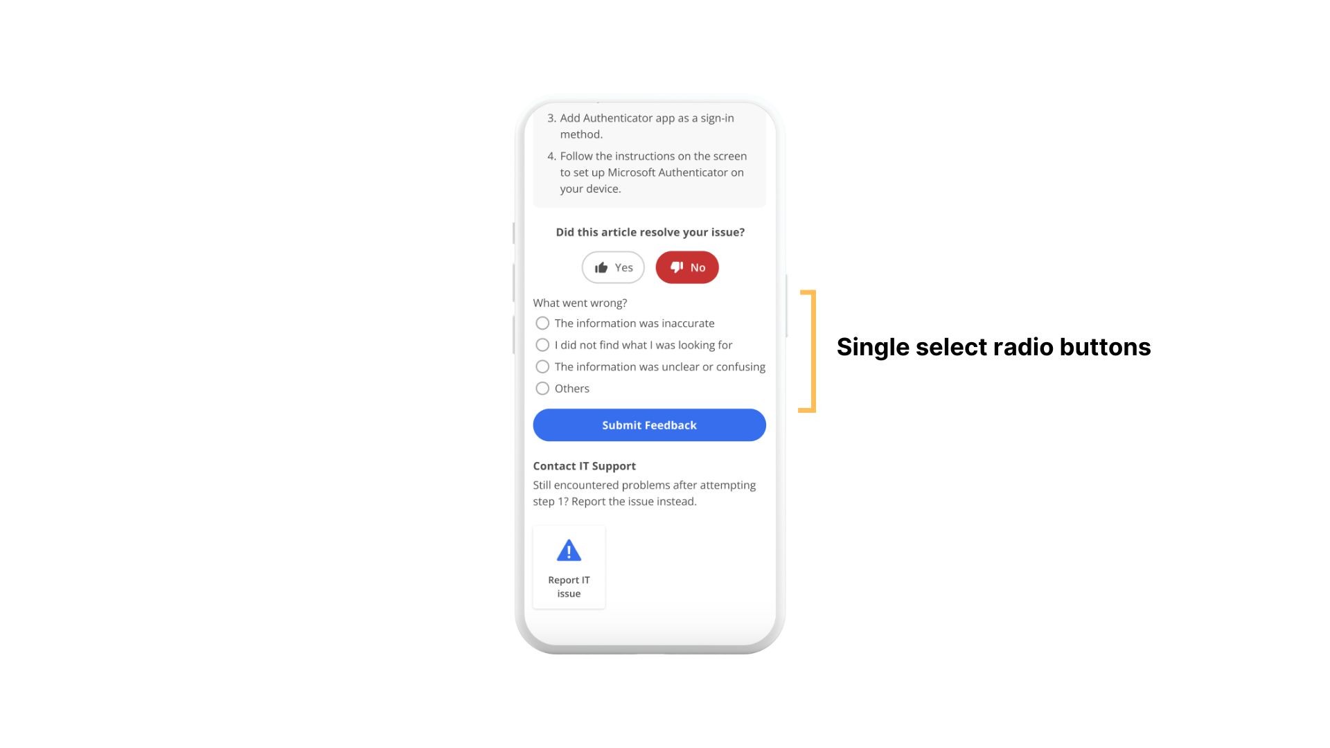
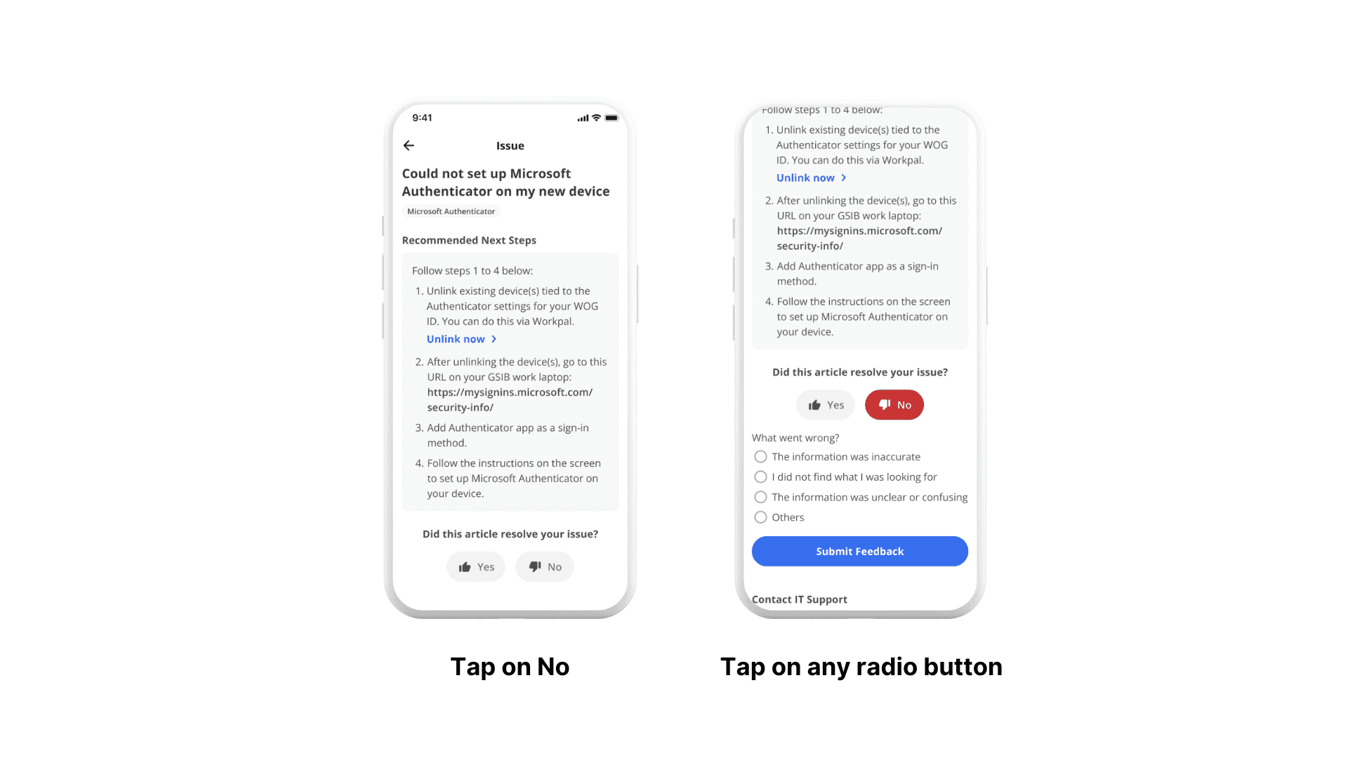
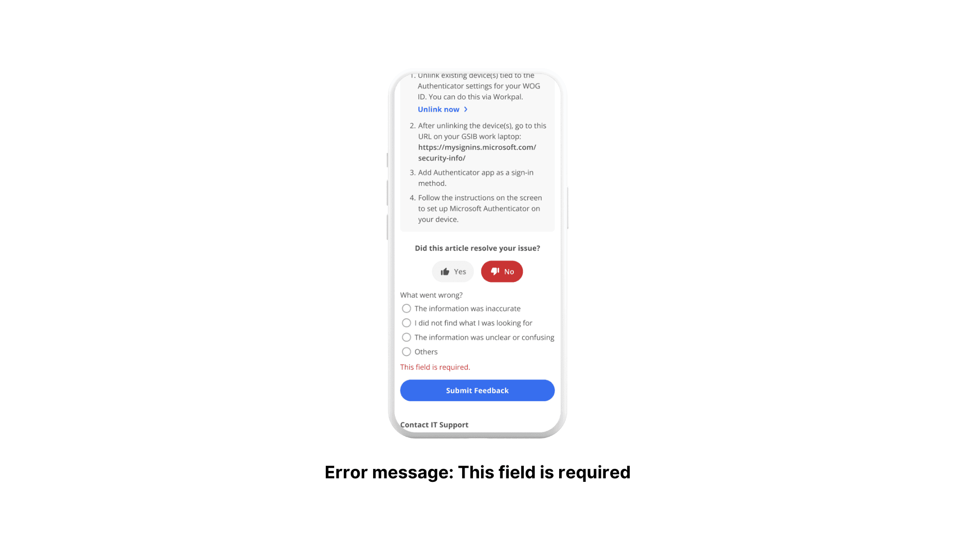
The decision to use radio buttons instead of checkboxes was based on the rationale that users will rarely encounter more than one issue. But if that does occur, they can still provide information in the open-ended section.
In addition, presenting a list of potential reasons for users to pick from, as opposed to an open-ended section, streamlines the feedback process and data analysis for article improvement.
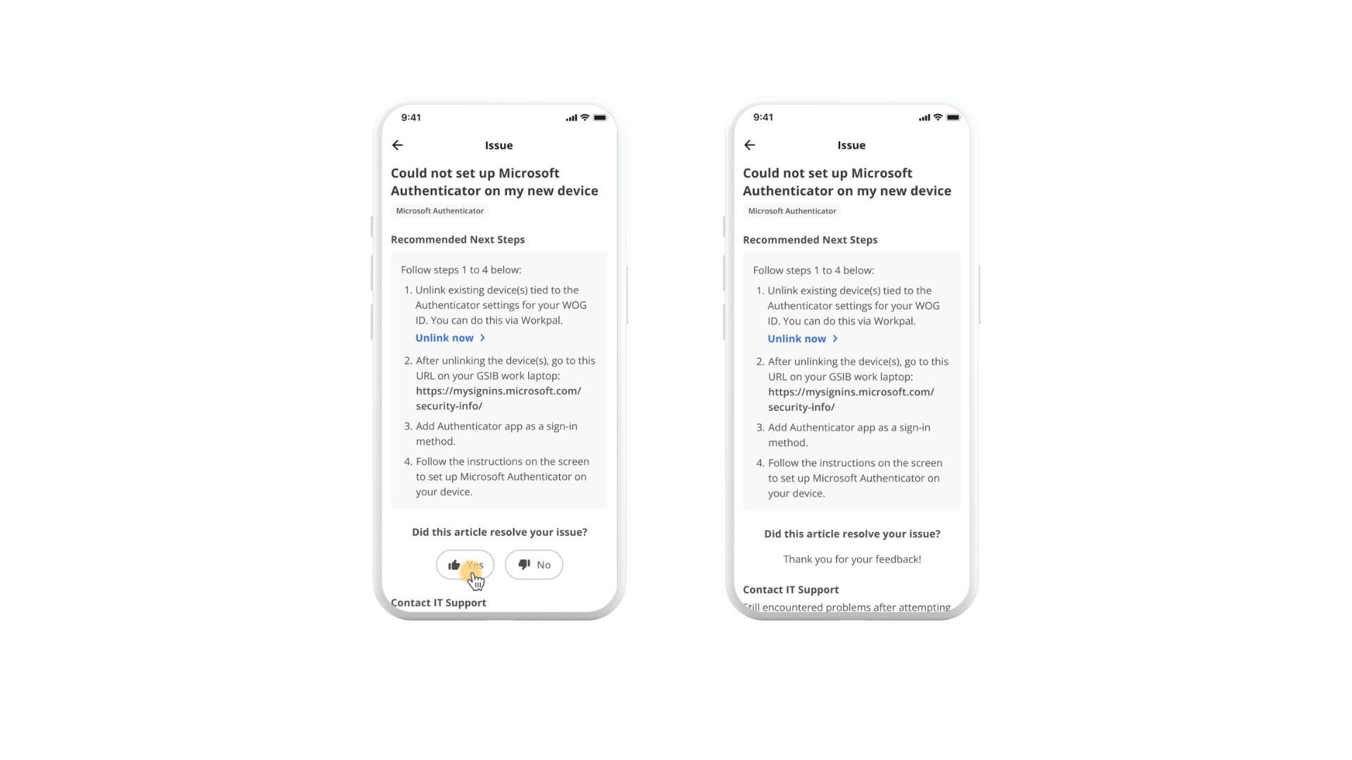
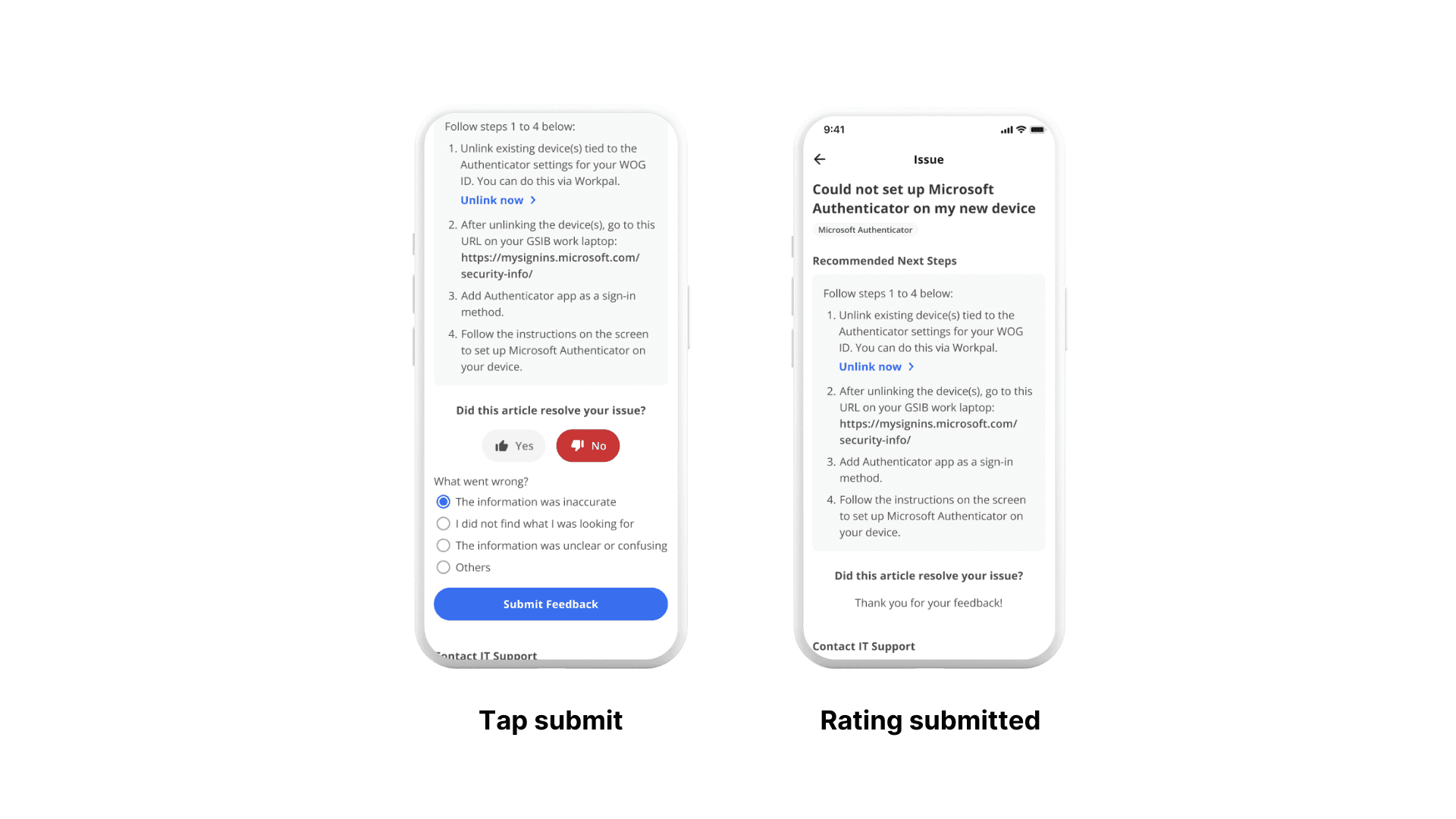
The immediate submission of a positive rating helps to reduce friction for users, removing the extra step to explain why the article was helpful. Ultimately, this helps to increase the response rate.
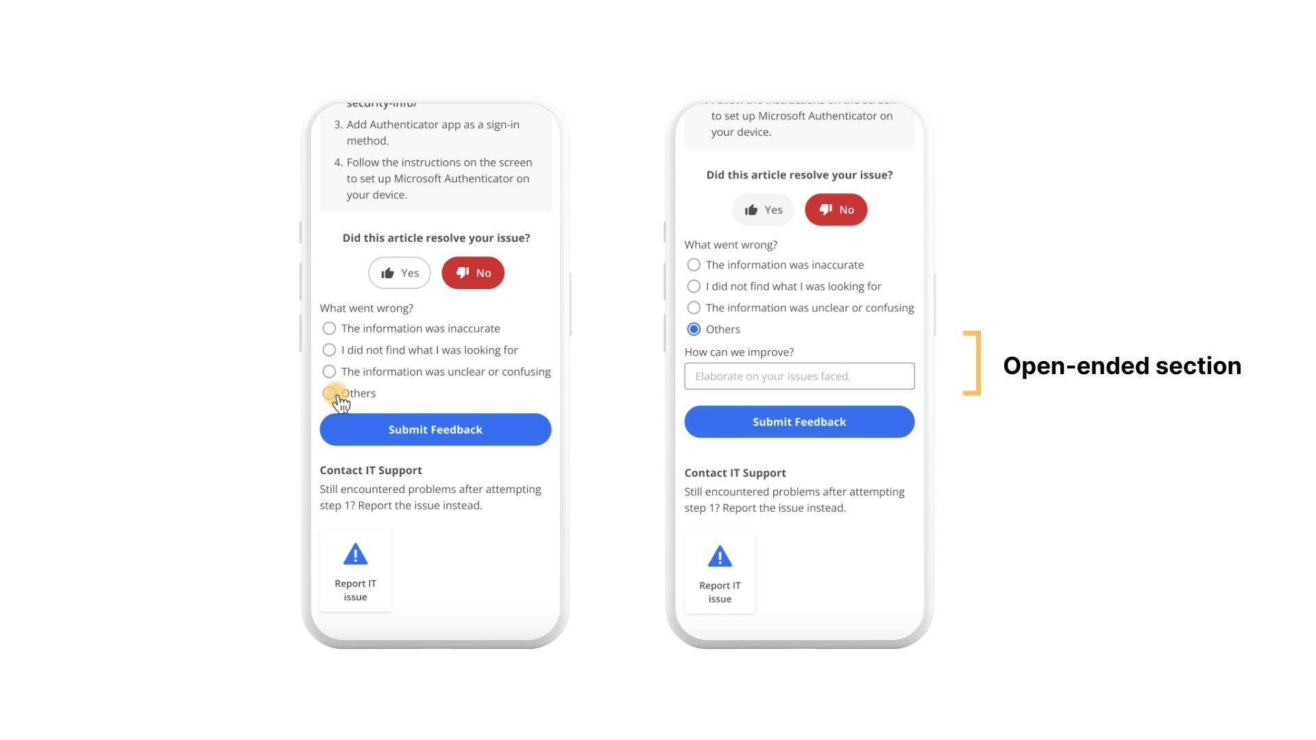
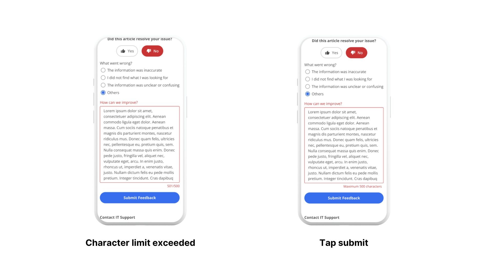
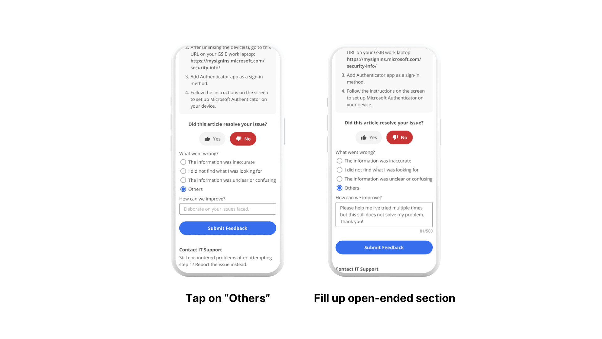
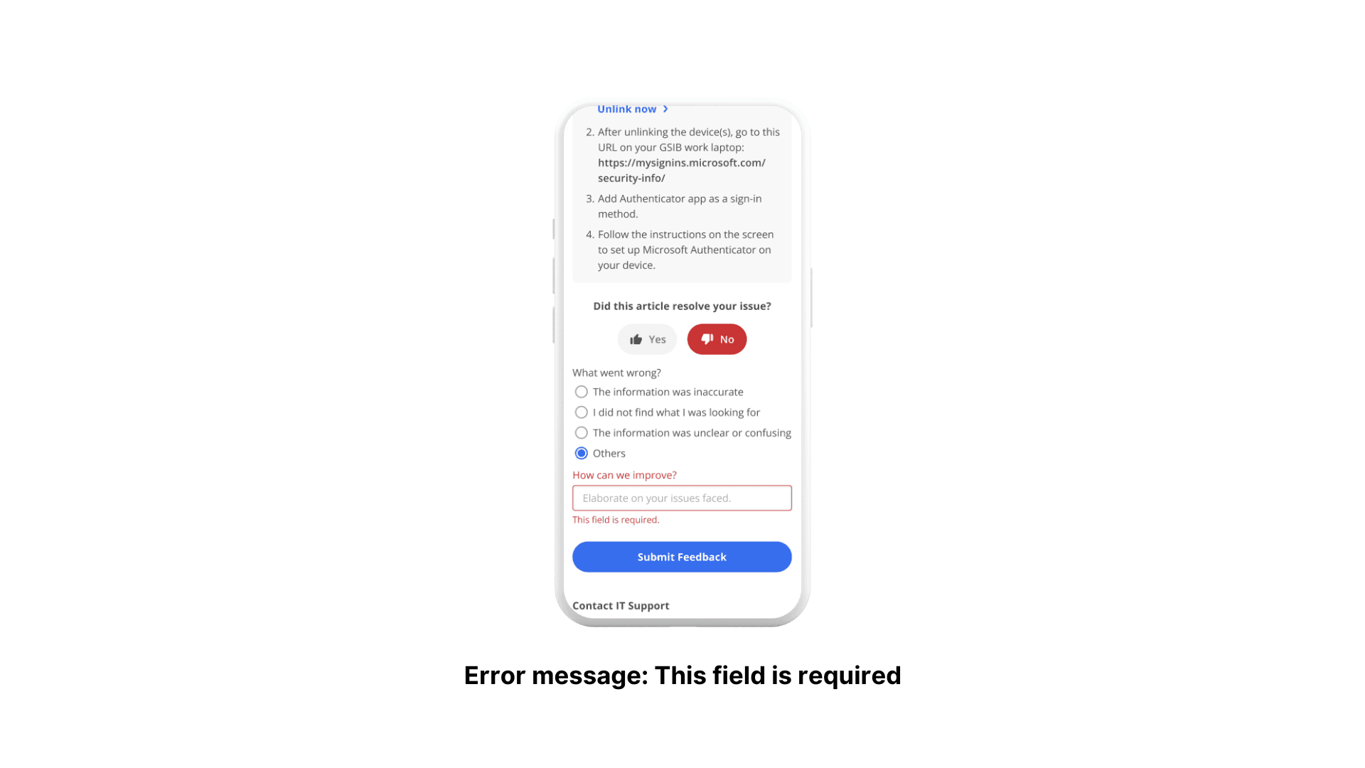
To reduce clutter within the screen, we decided to only make the open-ended section visible when the "Others" option is selected. Here, the challenge lies in finding a middle ground between maximising the amount of data gathered and streamlining the feedback process for users by minimising clutter and other distractions.
High-Fidelity Prototype
After discussions with the business and development team, I prototyped the key flows. Unfortunately, my internship ended before I could conduct usability testings with the prototype. Another UX designer will be proceeding with the UTs to validate the design decisions.
1.1. Submit a negative rating
1.2. If "Others" is selected
Submit a positive rating
Error Flow: User did not select a radio button
Error Flow: User did not fill up open-ended section
Error Flow: Open-ended section exceeds character limit